Why Your Paid Traffic Doesn’t Convert: A 12-Point Message-Match Audit You Can Fix Today
A paid campaign can post a decent CTR and still be broken.
That usually happens when the click and the conversion are being asked to do different jobs. The ad wins attention. The landing page has to earn trust. The offer asks for commitment. The checkout adds friction. Somewhere along that path, the visitor stops feeling like they’re in the right place.
That’s why low conversion is usually a diagnosis problem, not just a copy problem. A click proves interest in the first promise. A conversion happens only when the rest of the funnel delivers on that promise without adding the wrong kind of friction.
Why paid traffic clicks but still doesn’t convert
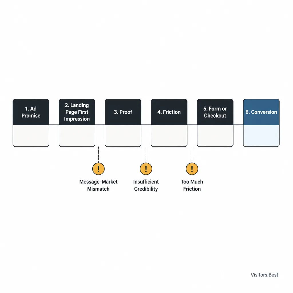
CTR measures curiosity. Conversion measures fit.
CTR is an upstream signal. It tells you the ad was relevant, interesting, or emotionally sharp enough to earn a click.
Conversion rate tells you something harder: whether the traffic, page, offer, and next step actually fit together.
That distinction matters. An ad might promise “Get real estate leads in 24 hours,” while the landing page opens with “Scale your business with smarter acquisition systems.” The click came from a concrete outcome. The page greets the visitor with abstraction. That’s message drift, and it hurts conversion before anyone reaches your proof block.
Audit the path in order
Most marketers diagnose paid traffic problems too late in the funnel, or too broadly.
A better approach is to audit the path in sequence:
ad promise -> landing page first impression -> proof -> friction -> form or checkout -> mobile UX -> speed -> pre-sell -> traffic segment fit -> offer constraints -> CTA commitment
That order keeps you from changing five things at once and learning nothing.
How to use this 12-point audit
Run it top to bottom
If you rewrite the hero, shorten the form, change the CTA, swap placements, and test a new offer on the same day, performance may improve, but you won’t know why.
Run the audit in order. Fix the highest-probability mismatch first.
Track micro-conversions before you rewrite the page
If your analytics are incomplete, you still need basic diagnostics. At minimum, track:
- CTA clicks
- form starts
- form completions
- checkout step progression
- conversion rate by device
- conversion rate by geo or placement
Google Analytics 4 and Google Tag Manager are enough to build a workable view of where users stall.
1. Does the landing page repeat the ad’s core promise immediately?
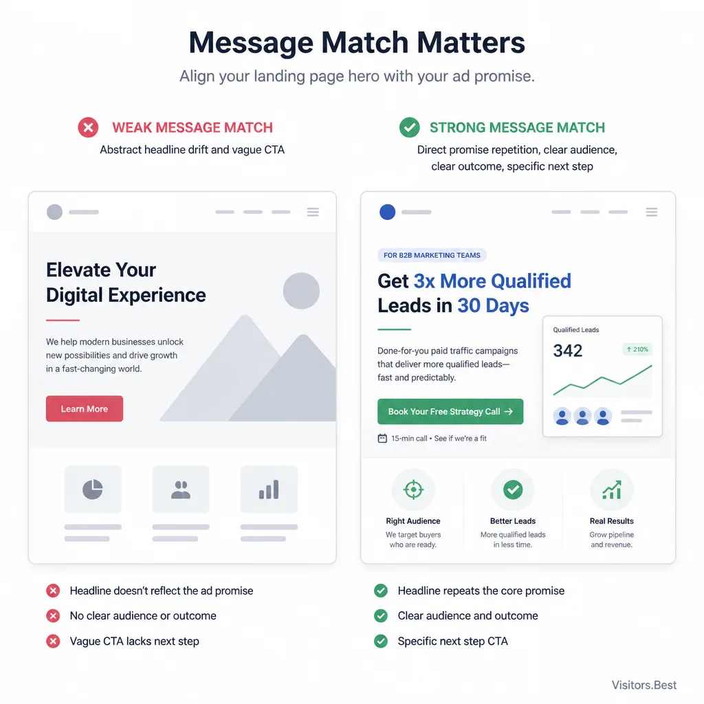
Failure mode: headline drift
This is one of the most common leaks in paid traffic. The ad is clear. The page tries to sound polished.
Weak match:
- Ad: “Compare Medicare plan options in minutes”
- Page hero: “Smarter healthcare choices for modern consumers”
Better match:
- Page hero: “Compare Medicare plan options in minutes — no long phone call required”
Fix: mirror the promise, audience, and outcome above the fold
Your first screen should reassure the visitor before it tries to persuade them.
Keep these aligned:
- the promised outcome
- the intended audience
- the next step
Measure: bounce rate and time-to-first-action
Bounce rate is imperfect, but alongside time-to-first-action and hero CTA clicks, it becomes useful. If visitors leave quickly or hesitate right away, your first-screen message may be drifting.
2. Is the page matching the visitor’s actual intent, not just the keyword or ad angle?
Failure mode: a curiosity click meets a high-commitment page
A curiosity click often performs badly on a page that jumps straight into a long application or hard close.
Cold traffic usually needs orientation and a lighter first step. Retargeting traffic can tolerate a shorter, more direct path.
Fix: match page depth and CTA to traffic temperature
If the click is cold, test a softer progression:
- “Check eligibility”
- “See pricing”
- “Get a quote estimate”
Instead of:
- “Buy now”
- “Apply now”
- “Complete your full request”
Measure: scroll depth and CTA click-through rate
Scroll depth alone can mislead. Deep scrolling with low CTA CTR often means interest without conviction, or a page that waits too long to ask for action.
3. Does the above-the-fold section answer the first three questions?
Visitors want to know, fast:
- What is this?
- Why should I care?
- What happens next?
If your hero misses any of those, the rest of the page is working uphill.
A weak hero sounds like category copy: “Performance-driven growth solutions.”
A stronger one names the outcome: “Get mortgage leads from paid traffic without sending visitors through a long quote form.”
Fix: tighten the hero and clarify the CTA
A strong hero usually includes:
- a clear offer or outcome
- one practical reason to care
- a CTA that explains the next step
“Get started” is rarely enough. “Check your options” or “See available plans” is clearer.
4. Are you using the right kind of proof for this offer?
Failure mode: generic testimonials where specificity is needed
Not all proof addresses the same objection.
If the real concern is lead quality, a testimonial that says “Great service” does almost nothing. A more useful proof block might say: “Lead approval rate held up on mobile Facebook traffic after we shortened the form.”
That kind of specificity matters. It reduces a concrete risk instead of adding decorative credibility.
Fix: replace vague praise with proof that answers the real objection
Useful proof types include:
- quantified testimonials
- case snippets
- screenshots
- third-party reviews
- trust badges
- policy clarity
- FAQs that answer objections directly
Keep it truthful and compliant. In regulated or sensitive verticals, claims need to be supportable.[^1]
Measure: scroll-to-proof engagement and assisted conversions
If users reach the proof section but still don’t act, the issue may be the type of proof, not the amount.
5. Is there hidden friction between interest and first action?
Failure mode: too much copy, too many choices, unclear next step
Hidden friction is usually structural, not visual.
Common causes:
- too many navigation options
- multiple competing CTAs
- long intro sections before the first action
- vague button labels like “Submit”
- repeated explanation blocks that delay action
Fix: reduce competing actions and lighten the first step
Two same-day fixes are often worth testing:
- remove extra links and secondary actions
- replace generic CTA copy with a clear next-step label
“Submit” becomes “See your matches.”
“Learn more” becomes “Check availability.”
Measure: first CTA clicks and form starts
If CTA clicks improve but form starts do not, the button may be clearer while the next step is still too heavy.
6. Is the form or checkout asking for too much, too soon?
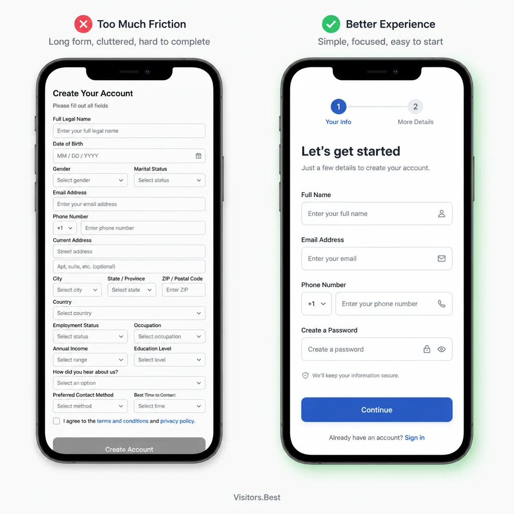
Failure mode: mobile users drop at the form
A long form does not always mean low conversion. But on paid traffic, especially mobile-heavy traffic, it is often where momentum dies.
Common failure points:
- too many required fields
- hard questions too early
- too many dropdowns
- hidden validation errors
- no autofill support
Fix: shorten fields, reorder inputs, use progressive disclosure
Good same-day tests include:
- removing nonessential fields
- asking easy questions first
- triggering the numeric keypad for phone fields
- splitting one heavy form into two lighter steps when possible
Baymard Institute and Nielsen Norman Group have long documented how form and checkout friction suppress completion.[^2][^3]
Measure: form abandonment and field-level drop-off
If users start the form but consistently abandon at one field, you likely have a design problem, not just a traffic problem.
7. Is the mobile experience quietly killing conversion?
Failure mode: buttons, spacing, and input friction on small screens
A page can look fine in a desktop preview and still fail on mobile.
A common example: the CTA sits below a tall image, the keyboard covers field labels, and a sticky bar partially blocks the button. Nothing looks obviously broken, but the experience is slower and more irritating than it should be.
Fix: design for thumbs, speed, and clarity
Check:
- button size and spacing
- whether sticky elements block action
- whether fields stay visible while typing
- whether key content appears before a long visual block
If most of your paid traffic is mobile, the page should be designed mobile-first, not just squeezed onto a smaller screen.
Measure: mobile conversion rate versus desktop
Tools like Microsoft Clarity or Hotjar can surface rage clicks, dead clicks, and other friction. If you don’t have them, device-level conversion rate and form completion splits still tell you a lot.
8. Is page speed killing momentum at the worst moment?
Failure mode: slow load right after the click
Slow pages waste money at the most expensive moment: immediately after the click.
On mobile networks especially, heavy scripts, oversized images, and bloated page builders can kill momentum before the visitor even sees the offer.[^4]
Fix: compress assets, reduce scripts, simplify the page
Start with:
- compressing images
- removing nonessential third-party scripts
- deferring tags that do not need to load first
- simplifying heavy design elements
Use PageSpeed Insights to spot obvious problems.
Measure: load time, landing-page abandonment, time-to-first-action
Speed isn’t just a technical metric. In paid traffic, it’s a conversion metric.
9. Is your pre-sell page warming the click or wasting it?
Failure mode: pre-sell adds curiosity but not conviction
A pre-sell page helps only when it resolves objections and improves readiness.
A common mistake is leading with a long story that increases scroll depth but delays the selling moment. That can work in some advertorial flows, but it often wastes high-intent clicks.
Fix: reorder sections to bridge objection, proof, and CTA
A stronger sequence is often:
- name the concern
- explain the mechanism
- add proof
- present the next step
If your ad promises an easier way to compare insurance options, the pre-sell should quickly reduce distrust and effort anxiety, not wander through a slow narrative.
Measure: click-through to the offer page and pre-sell exit rate
If the pre-sell gets engagement but poor click-through, it is consuming intent instead of warming it.
10. Are geo, device, and placement mismatches lowering conversion quality?
Failure mode: traffic technically qualifies but still doesn’t convert
“Bad traffic” is often too vague to help.
You may not have a source problem. You may have an Android vs. iPhone, Tier 1 vs. unsupported geo, or single placement inside a network problem.
A realistic example: a campaign converts acceptably on Android in English-speaking Tier 1 markets but collapses on low-intent in-app webview traffic from one placement. That doesn’t mean the funnel is broken. It means the segment is.
Fix: segment by country, device, OS, placement, and network
Start with the cuts most likely to reveal mismatch quickly:
- device
- geo
- placement
- OS
- creative angle
Measure: conversion rate by segment and CPA spread
Do this before pausing a whole source.
11. Are offer constraints blocking willing buyers or leads?
Failure mode: payout caps, unsupported geos, payment limits, compliance friction
Sometimes the traffic is fine and the page is fine. The offer is the bottleneck.
Common constraints include:
- unsupported countries
- strict lead validation
- poor approval rates
- limited payment methods
- late-stage compliance steps
- merchant-side checkout friction you can’t control
Fix: surface constraints earlier or change the offer
If affiliates can’t fix checkout or approval logic, the best move is often to pre-qualify harder or replace the offer instead of endlessly optimizing the page.
Measure: checkout drop-off, rejected leads, approval rate
If intent is strong but the economics break downstream, this is usually an offer-fit problem.
12. Is the CTA asking for the wrong level of commitment?
Failure mode: hard close before trust exists
This is a classic mismatch. The visitor is interested, but your CTA asks for more commitment than the click prepared them for.
Fix: test lower-friction CTAs and clearer next-step copy
Examples:
- “Buy now” -> “See pricing”
- “Apply now” -> “Check if you qualify”
- “Start your full quote” -> “Get an estimate”
These can improve micro-conversions, but watch downstream quality. More leads are not better if approval rate collapses.
Measure: micro-conversion rate and lead-to-sale quality
Front-end wins that damage back-end quality are not wins.
What to measure during the audit
Core metrics: conversion rate, CPA, RPC if relevant
These tell you whether the business result improved.
Diagnostic metrics: scroll depth, form abandonment, time-to-first-action, CTA CTR, micro-conversions
These tell you where the process is breaking.
At minimum, track:
- conversion rate
- CPA
- CTA clicks
- form starts
- form completion
- time-to-first-action
- checkout step progression
- device split
- geo split
- placement split
If setup is weak, fix that before running large tests. You don’t need perfect instrumentation, but you do need enough to avoid blind edits.
A simple decision tree: fix the page, change the traffic source, or change the offer?
Fix the page when clicks engage but stall mid-funnel
If visitors scroll, click, or start forms but fail later, the page or flow is usually the problem.
Think:
- weak first-screen clarity
- wrong proof
- hidden friction
- mobile form problems
- checkout burden
Change the traffic source when segments show poor fit from the start
If users bounce quickly, hesitate immediately, or one segment performs badly from first touch, look at:
- placement mismatch
- creative mismatch
- low-intent audience
- unsupported geo or device mix
Change the offer when intent is strong but constraints or economics break conversion
If users make it deep into the flow but:
- approval rate is poor
- checkout completion is weak
- payment coverage is limited
- lead rejection is high
then the offer may be structurally wrong for that traffic.
Start with the highest-leverage mismatches
Prioritize:
- promise match
- first-screen clarity
- friction reduction
- mobile form cleanup
- offer fit
Button color tests can wait.
Conclusion
Most paid traffic conversion problems do not come from one weak headline. They come from a broken chain of message match from ad to page to offer to checkout.
That is the more useful way to think about it. Not “How do I make this page more persuasive?” but “Where does the promise stop feeling true?”
Start there. Run the audit in order. Fix the highest-leverage mismatches first. The goal is not more activity in the funnel. It is tighter fit between the click you bought and the action you need.
FAQ
Why can paid traffic get clicks but still fail to convert?
Clicks usually show that the ad earned attention or curiosity. Conversions depend on what happens next: whether the landing page continues the promise, matches visitor intent, reduces friction, and presents an offer the traffic can realistically complete.
What is message match in paid traffic?
Message match is the continuity between the ad and the rest of the funnel. It includes the headline, offer framing, proof, CTA, form experience, device usability, and whether the traffic segment fits the offer’s constraints.
How do I know whether the problem is the page or the traffic source?
If visitors bounce quickly or perform poorly from the first touch, the issue is often traffic quality or intent mismatch. If they scroll, click CTAs, or start forms but do not finish, the page, form, checkout, or offer flow is more likely to be the problem.
What should I measure besides CTR when conversions are weak?
Start with conversion rate, CPA, and, if relevant, EPC or RPC. Then add diagnostic metrics such as time-to-first-action, CTA click-through rate, scroll depth, form starts, field-level drop-off, checkout progression, and conversion rate by device, geo, and placement.
What are the fastest landing page fixes to test first?
Start with the highest-leverage issues: repeat the ad’s core promise above the fold, clarify what the page is and what happens next, reduce competing actions, simplify forms, and check whether mobile users face friction that desktop reviews miss.
When should I change the offer instead of optimizing the page?
Change the offer when intent looks real but structural constraints keep blocking conversion. Common signs include unsupported geos, poor approval rates, limited payment methods, strict lead validation, or checkout steps you cannot fix on the page side.